Personal Statement

I was almost a social worker. Nearly half of my college career was spent studying child development, analyzing poverty charts, and discussing race relations, because despite it being my passion, I did not believe studio art could ever be more than my hobby. Given my interest in the magnitude and the diversity of human existence, such a compromise seemed like the right choice.

It wasn’t. I knew that when I stepped into a design professor’s office to ask about prerequisites. The multimedia menagerie of prints and camera obscuras and pseudo-stained glass that made its home on her shelves and walls felt like the first breath of fresh air I’d had in years. A few weeks later I officially declared a Graphic Design major. I have spent the past year loading my schedule with art history, media, and design courses such that I understand the tools for graphic design work and the global context from which it comes.

Approaching design as a compilation of disciples has been crucial in my work. Designing mock mural proposals, for example drew on my learning from multiple fields. My knowledge of art history taught me to research popular style trends, political influences, and societal values, whereas my studio background had ingrained in me the importance of color and dynamic composition. Design classes drew from these lessons and threw in the technical know-how needed to carry out my plans. I used similar methods in creating protest posters, institutionally critical magazines, and even my own resume.

What motivates me—in life in general and in my work—is the concept of being the best person I can be, which is a great deal of why I am drawn to advanced study in this field. Design is a discipline of constant feedback, critique, and improvement which encourages a creator to see multiple viewpoints, step outside their comfort zones, and push themselves to create something that fits their exact needs. It can be frustrating as all get out (especially navigating Adobe software) but I love it. I aim to be able to communicate with the world as seamlessly as possible.

There were a lot of roads I almost went down. Social worker, museum curator, mycologist, paleontologist, you name it. But I could not deny my instinct to create and to communicate. Through design I intake information that the world has to give me, make my sketches, and then dedicate myself to giving it information right back, just like I’m doing right now. It is in the MICA GDMA program that I hope to hone these skills.

A Favorite Visual Analysis: Christina’s World

Christina’s World by Andrew Wyeth

Using color, line, and space, Andrew Wyeth paints a piece that captures the nostalgic dullness of rural life, yet imbues it with event and intrigue. The tension between the two themes adds narrative to what could have otherwise been a simple landscape. 

Christina’s World states, instantly, that it is an image depicting rural life. Tawny grass, mostly uncut and growing tall, dominates the image. A single property, consisting only of gray, weather-beaten buildings, identifies itself with a pale mowed lawn. Combining the open and empty space with the dusty, muted colors communicates clearly that this is a landscape removed from the hustle and bustle of city life; it sits, waits, and ages like the yellowed edges of paper. The directional lines of the piece are largely flat. By splitting the sky and the land so drastically, the horizon dominates the painting. It is mimicked by the edge of the lawn. The verticals of the buildings are minimized and the diagonal tire tracks blend almost seamlessly with the grass. Because horizontals dominate the landscape, it becomes organized, placid, and serene. Uneventful, one might even say.

In contrast to this empty world, the woman—assumed to be Christina—is a force of energy. While she clearly belongs in this setting, wearing simple and a faintly colored dress, she consists of both the darkest and the lightest colors within the work. This draws the viewer’s eye to her, confirming that she is the focus of this scene. Furthermore, she is the largest element. The space between her and the houses is vast, but she fills a good portion of it. To balance her weight in the bottom left of the piece, Wyeth places the buildings on the top right. This isn’t the only diagonal alignment of Christina’s World. Contrasting the horizontals and simple lines of the buildings, Christina also follows a diagonal line. Not only does she face diagonally, but her body twists; she is not flat, rather contorted. Her linear elements provide her with a sense of movement and tension. The reader must now ask why she is saturated with such importance and how that contributes to the vague aura of mystery. 


Image

Resume

Image

Exhibition Catalog

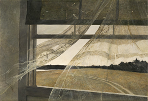
Andrew Wyeth, Wind from the Sea

1947

Egg tempera on canvas

47cm x 70cm

National Gallery of Art, Washington, D.C.

Provenance:

Sold January 1948 to Clay Bartlett in Manchester, Vermont; sold February 1952 to Charles Hill Morgan in Amherst, Massachusetts; gifted from his estate in 2009 to the National Gallery of Art, D.C.[1]


A window frame extends past the left boundary of the canvas. Through its muted, gray-brown frame, a breeze travels inward and lifts decorated but ragged curtains past the bottom of the border of the painting and into the viewer’s space. A dark, dirty and cracked shade covers the top section of the window pane. The landscape outside, which consists of a plain field of dying grass and a worn road, recedes backward to a far-away strip of trees and a sliver of water under a colorless sky. This is the view from a dormer window on the third level of Christina and Alvaro Olson’s house in Cushing, Maine, and it holds more meaning than is immediately visible. When opening the pane to cool down the room, the incoming sea breeze lifted the curtains in such a way that Andrew Wyeth was instantly inspired.[2] In his rush to remember this fleeting moment, he sketched it over top of a different image—a study of Christina Olson staring off into the distance. He then spent months refining and creating the final piece.[3]

Despite the painting’s lack of human figure, this paper will suggest that Christina Olson is the subject Wyeth truly depicts in Wind from the Sea. The two were introduced by Betsy James, Wyeth’s future wife and Christina’s longtime friend.[4] Christina, affected by a degenerative muscle disease that left her unable to walk, was taken care of by her brother Alvaro as the two made a meager living selling eggs and produce.[5] Because they lived in poverty, and Christina was disabled, their house and farm fell into a derelict state as the property became dirty, uninsulated, and in disrepair, explaining the poor physical condition of the window portrayed. Despite these conditions, Christina held onto her pride. She moved around the lower floor of the house by rocking a chair to move it and succeeded in cooking, sewing, and doing other chores.[6] While outdoors, she moved using her arms and tended to a small garden. There was a tenacity in Christina that Wyeth admired. Along with his many studies and paintings of the Olson property and house, Christina was his muse, and he painted portraits of her to capture her complex character.

Wind from the Sea, despite containing no figural image, can be read as a portrait of Christina Olson. The degeneration of her body is echoed in the decay of the painting; the upper shade and the left wall cracks while the lace drapes fray at the end, showing tears that end and disrupt the crocheted patterns. Painted by Wyeth with muddled browns and grays, the wood sits sun-bleached and aged. Christina is similarly worn, and her body, aging and misshapen, displays all the hardships she has faced. It is not difficult to see her wrinkles, bony limbs, and blotchy skin in portraits such as Miss Olson and a Kitten (1952) or Christina Olson (1947). The glass, too, is smudged underneath what remains of the grimy curtains and shade. No care has been put into this building’s repair and the neglect shows. Thus, Christina’s living conditions are readily visible and reflect her physical decline. Part of this decay is the drapery, which is not just a solid and rotting but thin lace, fragile and susceptible, just as Christina is physically weak and relies on the help of others. Outside, the grass withers and the water—a source of life—is small and distant.

Miss Olson and a Kitten, 1952

Christina Olson, 1947

Decorated with crocheted birds and flowers, however, this lace curtain is more than just fragile. It is feminine and “delicate as the real Christina”[7]; age has not stripped it of its beauty. The wooden frame is aged but sturdy. The stiff horizontals, sharp angles, and solid beams mirror Christina’s core strength of character; her fortitude was unmatched.[8] Both, stripped of embellishments, exist as their genuine selves. A sense of pride is shared by Christina and this window, as both are “still standing” despite adversity. More importantly, they do so unapologetically. Though in disrepair, this window is not sunken or broken, but stands firm and functional. Christina was keenly aware of her challenges in life but remained strong, so much so that Wyeth considered her moral fiber comparable to that of a queen.[9] The road outside indicates movement and action, something Christina did not allow her disability to keep her from.[10]

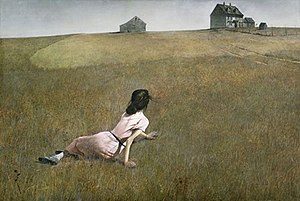
Christina’s World, 1948

 Wind from the Sea is a symbolic, interior portrait of Christina Olson. The viewer is not on the outside looking in, as is the case in Christina’s World (1948). In Christina’s World, there is an air of mystery around her figure that leaves open questions of where she is, what she feels, and why her body is the way it is. These are questions posed by a composition from the view of an outsider. Wind from the Sea, however, is a view from the inside looking out; it is an interior view wherein the content of Wind from the Sea answers the question of who Christina is. She is someone fragile, damaged, and coarse, and yet she is also someone resilient, elegant, and proud. Wyeth depicts the genuine complexity of a human character without including a human body, telling the audience that Christina’s spirit remains a force to be reckoned with, just as lively and inspiring as the wind that blew in from the sea.


Bibliography

Anderson, Nancy K., and Brock, Charles. Andrew Wyeth: looking out, looking in. New York: Distributed

Art Publishers, Inc, 2014.

“Andrew Wyeth.” Andrew Wyeth. Accessed November 23, 2018. http://andrewwyeth.com/timeline

Geselbracht, Raymond H. “The Ghosts of Andrew Wyeth: The Meaning of Death in the Transcendental

Myth of America.” The New England Quarterly 47, no. 1 (1974): 13-29. doi: 10.2307/364325.

McCord, David. Andrew Wyeth. Meriden: The Meriden Gravure Company, 1970.

Meryman, Richard. Andrew Wyeth: a secret life. New York: HarperCollins Publishers, 1996.

Meryman, Richard. “Andrew Wyeth.” Life Magazine, May 1965.

“Wind from the Sea.” National Gallery of Art. Accessed November 23, 2018.

https://www.nga.gov/collection/art-object-page.143926.html

“Wyeth, Andrew.” Benezit Dictionary of Artists. 2011.

https://doi.org/10.1093/benz/9780199773787.article.B00199589

Wyeth, Andrew, Thomas Hoving, Katharine Stoddert Gilbert, and Joan K. Holt. “Two Worlds of Andrew

Wyeth: Kuerners and Olsons.” The Metropolitan Museum of Art Bulletin 34, no. 2 (1976): 1-192. doi:10.2307/3258845.


[1] “Wind from the Sea,” National Gallery of Art, accessed November 23, 2018. https://www.nga.gov/collection/art-object-page.143926.html


[2] Nancy K. Anderson and Charles Brock, Andrew Wyeth: looking out, looking in. (New York: Distributed Art Publishers, Inc, 2014), 19

[3] Andrew Wyeth, Thomas Hoving, Katharine Stoddert Gilbert, and Joan K. Holt, “Two Worlds of Andrew Wyeth: Kuerners and Olsons,” The Metropolitan Museum of Art Bulletin 34, no. 2 (1976): 145, doi:10.2307/3258845.

[4] “Andrew Wyeth,” Andrew Wyeth, accessed November 23, 2018, http://andrewwyeth.com/timeline

[5] Richard Meryman, Andrew Wyeth: a secret life. (New York: HarperCollins Publishers, 1996), 8-12

[6] Ibid

[7] Nancy K. Anderson and Charles Brock, Andrew Wyeth: looking out, looking in. (New York: Distributed Art Publishers, Inc, 2014), 21

[8] Andrew Wyeth, Thomas Hoving, Katharine Stoddert Gilbert, and Joan K. Holt, “Two Worlds of Andrew Wyeth: Kuerners and Olsons,” The Metropolitan Museum of Art Bulletin 34, no. 2 (1976): 141, doi:10.2307/3258845.

[9] Richard Meryman, “Andrew Wyeth,” Life Magazine, May 1965, 102.

[10] Richard Meryman, Andrew Wyeth: a secret life. (New York: HarperCollins Publishers, 1996), 8-12


Reflections on Vince Buschemi’s Visit

A few things came to mind when listening to Vince Buschemi describe digital marketing and its place in the world. First, that this was a very loud man. Second, that a lot of what he described sounded like the job my friend’s sister, Madelyn, has (that I wish I did). A third, I wondered about the age range of people who work on marketing and digital identity projects.

I met Madelyn when my friend and I stayed overnight with her after attending a concert, and there she described her job to me. Her company works for other companies to design their brands, labeling, websites, and products. After researching and meeting with members of that company, she would try to peg down its “personality.” Was it a refined, traditional company? Or one that had a lot of snark? What was its audience? I was totally enamored with this idea. Vince’s discussion of brand identity, specifically Flying Dog’s, brought the whole thing back to mind. I love the aspects of problem solving, team work, and creation in this career. Maybe it’s something I should look into!

Another thing that I was left wondering about was the question of who makes up a social media team? Personally, I believe that each team (of high budget or performing companies) should have a teenager, a middle aged person, and an older citizen on deck to look at the content they intend on posting and give feedback. As digital natives, young people understand nuances and references that older people might not. An “average citizen” of middle age will give an idea as to how less “in the loop,” but still competent internet users might react. An older user, or someone less adept, can give input on how user-friendly the content is, if it’s still understandable to people who may have little to no knowledge of certain pop cultures, etc. Of course that’s generalizing people by their age, but it leads to some important issues in my opinion.

A Reflection on American Art

I was definitely wary of a reenactment game at first, especially one focused around American Art in the 1930’s. This was a period I knew little about, and as if that weren’t bad enough, I was still pretty shaky on defining socialism, communism, and other political movements that had such a strong impact on American Art. Luckily I feel that I have a more solid grasp on the subject after being put through the wringer. American Art of the 1930s, easier to define now in the “future” than during its time period, revolved around a diversity of styles that, ultimately, all attempted to be relatable to the viewer and act as a source of pride. Today the picture is much fuzzier.

Major art movements have a European-centric vein running through them. Across the sea it was very organized–a linear progression of one movement influencing the next, which would influence the next, and etc. I view that as a starting point from which American Art grew. It drew inspiration from the European vein, taking at different points, but ultimately evolving into a tree of its own. It grew and branched in different directions, all aiming high and hoping to support its own organism–the American collective and the good of the people, whether this be through calling out injustices or giving the worker his deserved recognition. Largely unattached from the roots, some movements (the Harlem Renaissance, for example) were built amid this expansive of diversity and had their own communities to foster.

While trying to pin down the art of the 1930s is difficult, it pales in comparison to defining artistic movements while living in them. The world is globalized and social media challenges what is and is not “American.” Does it have to be created in America to be American? Can an American living in Berlin, or a Nigerian living in America still create American Art? Many Americans have lost their pride and can offer no solutions. Many documented Americans would rather not identify as such. I hate how intangible the definitions of art are during the present (I don’t really, I revel in the glory of the unknown, but it still frustrates me to no end), and I genuinely cannot offer any answers.

Back at it Again

On October 5th, 2018, Banksy did it again. After the gavel landed declaring that his work, Girl with Balloon, would be sold at a Sotheby’s auction for 1.4 million US dollars, a shredder that artist had built into the frame began shredding the canvas at an almost infuriatingly deliberate pace. A little over half of the work was in strips, dangling from the bottom edge of the frame before it was removed from the room, leaving the attendants in muffled shock and the buyer looking rather constipated.

On October 6th Banksy posted a video 58 seconds long on his Instagram with the caption, “‘The urge to destroy is also a creative urge'” – Picasso.” The day before the video he posted an image titled “Going, going, gone…” of the bewlidered auction-goers staring at the shredded piece and yesterday, October 17, he posted an image of the intact work with a caption linking to “the Director’s cut” of the shredding with the affirmation that the painting did, in fact shred and that the auction house crowd was not part of the act. The partial shredding, however, was a malfunction.

The original buyer did continue with her purchase. The question is: why? I, along with countless others, would argue that the stunt, which couldn’t have been done by anyone else, increased the value of the work exponentially.

Avant-garde art functions off the premise that was is established must be challenged, and what is bold is truer art. Banksy, in this action, follows those guidelines. He challenges the wealth of the auction-goers, which is not out of character for an artist who gained popularity through his attention to the injustices of society, the hypocrisy of the infamous “those in charge” and the value of change, kindness, revolution, etc. Essentially, he plays with the Soetheby’s crowd and overturns the norm.

Furthermore, Banksy’s quote from Picasso reminds that art is of a fluid nature. It can be created, changed, or destroyed. And if we include action painting, performances, and more under our definition of art, why not destruction as well? Don’t we get just as much (if not more) fun out of destroying sandcastles as we do making them?

I will agree that this stunt could not have been pulled off by anyone else. Banksy has an established reputation as a rebel, a house-hold name that allows this story to gain such popularity, and a large social media following. Soetheby’s, too, is a well known event. He knew that this would be an event to get his name back in the papers. He knew it was a long time coming.


Helvetica

To the average person, Helvetica is an omnipotent, but unnamed force. Since its creation in 1957, it has become one of the most widely use typefaces in (at the least) western society. Originally named Neue Haas Grotesk, it was created by Swiss typeface designers to match the resurfacing interest in sans-serif fonts and to promote a new age of modernism. And damn if it didn’t do its job well. American Apparel, Target, AmericanAirlines, Toyota, Jeep, JC Penny, Crate&Barrel—these are just a few of the many companies that use Helvetica for their logos. Countless street signs, posters, and websites utilize it. Even our taxes are in Helvetica! Disregarding “gray areas,” there are two main opinions on Helvetica among designers: pro and con. Here are the general reasonings presented by the two opposing sides. 

Those in favor of Helvetica cite the technical beauty of the typeface and its diverse applications as their reasons. The Cap and X heights all align perfectly with no excessive ascenders or decenders. Terminals cut off at perfect horizontals. The kerning is even while still taking into account the widths of thin and thick letters (think, i versus w). The negative space, too, is just as important! The shapes formed by the lack of ink seem to perfectly hold the letters in place. Beyond its technical beauty, Helvetica has been stated by some to be an “everyman,” because its lack of personality allows companies to inject it with their own. Furthermore, when first invented, it was used as a “wiping of a slate,” a way for a company to brush off the flourish of the 50s and align itself with modernity.

Those opposed to Helvetica tend to find it boring, a lazy first resort, or consuming and oppressive. They would argue that the identical nature of the letters strips its personality entirely (as well as that of those who use it). It is too even, too simple, and too safe. This safety is another argument. Because it is so safe, too many designers are using Helvetica as the easy way out of unique design, which can lead to the third point of opposition: conformity. Everyone, for fear of making bad decisions and to be aligned with modernity, chooses Helvetica, including big companies. Thus, Helvetica becomes associated with big business, with capitalism, and with control. Sure, using Helvetica makes companies seem rational, dependable, and hip, but how do these companies make Helvetica seem?

*This information is all based off of the documentary, “Helvetica,” directed and produced by Gary Hustwit.

Some Thoughts on Why

I would argue that almost no one is born hating art. Coloring, crafting, playing with Legos, eating glue, it doesn’t matter—kids love it. Before I could speak I was roaming over every surface in front of me with the cheapest crayons money could by. I got lucky that I kept that enthusiasm (I am still incredibly drawn to drawing on things I shouldn’t), but it wasn’t just a matter of inherent personality. It was an issue of conditioning. Sitting here, half delirious off of NyQuil, I am telling you that contemporary artists only become so as they are allowed to be. Please bare with me while I use my observations as an art camp counselor and personal experiences to argue this.

Insecurity rocks our tiny bodies once we come into social contact with other kids. Not in the way we adults have it. Body image, wealth discrepancies, and social hierarchies appear to be nebulous concepts to kids before they reach puberty. The lines are very thin and easy to break. One thing my campers did seem to understand, however, was the concept of “better.” A dangerous concept in art camp. The making of projects was fun, but the finishing of them was tumultuous, because a fair portion of the kids would look around comparing their work to others’ and find something to put themselves down for. I don’t think this was a natural instinct, because some of the others didn’t do it and the younger campers nearly never did it. I think it was learned. 

I myself have had a lot of support and positive feedback. I know this and I’m grateful for it. Given the way I’ve acted in other subjects, I don’t think I would have had the gusto to proceed in art without this positivity. So it’s like operant conditioning says: a positive reinforcement (praise) will increase the behavior (creating art) whereas a negative one (apathy, criticism) will decrease it. The kids who were happy to make art, regardless of skill, were the ones who commented most often that their parent was excited to see it or that they’d give it to them, implying that that parent was more receptive and more likely to respond positively to their art. That child, unburdened by insecurity, would be more likely to keep creating. 

Emil Nolde’s “Winter”

Emil Nolde’s “Winter,” 1907.

Nolde uses visual elements to their full potential in his 1907 oil piece, Winter. It is through color, stroke, and line that he establishes an expressive struggle between man and nature.

Stroke and Line

The power of nature is emphasized through the contrasting strokes and directional lines. The choppy, chaotic brushstrokes lend depth, power, and weight to the snow that breaks it up from the typical, flat placidity of a freshly fallen blanket and imbue it with energy. Note, also, the slanted strokes dominating the sky. Mimicking precipitation, as if snow or sleet were falling, the strokes encourage other senses: wet precipitation, cold wind, slippery roads, all effects of the planet’s natural cycles. Directional lines ensure that this scene is one of action. The horizon slants up to the right, creating a hill and a journey for this man to face. Most striking, however, is the inclusion of contrasting lines and strokes to really send this piece spiraling. Evergreens made of horizontal strokes contrast the tall, vertices branches of dead trees; the road wanders up from the bottom right, bisecting the horizon and blending into the mass of trees. These contrasts indicate that nature is not easily categorized or tamed; it is full of  elements that will move their own way regardless of the rigidity of man, for he is but a small, vertical mark with smoother strokes than the world around him.

Color

Color is used to indicate the contrast between man and nature and the impact of them upon one another in Nolde’s Winter. The blatant contrast between a man dressed in black and the snow he trudges through is quite jarring; this man becomes the focal point, quickly drawing the eye from the lighter and more muddled background. I say muddled because it is important to note this additional contrast–the man’s colors are simple, having just a slight highlight on one side, whereas the landscape is composed of a myriad of blues, whites, greens, browns, pinks, purples, reds, and blacks. The road is largely a muddied brown that contaminates the snowbanks around it; it is an unpleasant stain that divides, but disappears into the landscape that it dirties. Yet, the sheer amount of landscape colors, however multicolored, dwarf the man and his path. The impact of the man and road’s presence is strong, but it cannot compare to the power of the landscape.