Monthly Archives: October 2018

A Reflection on American Art

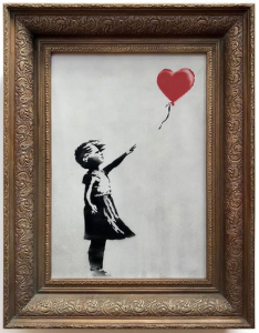
I was definitely wary of a reenactment game at first, especially one focused around American Art in the 1930’s. This was a period I knew little about, and as if that weren’t bad enough, I was still pretty shaky on defining socialism, communism, and other political movements that had such a strong impact on American Art. Luckily I feel that I have a more solid grasp on the subject after being put through the wringer. American Art of the 1930s, easier to define now in the “future” than during its time period, revolved around a diversity of styles that, ultimately, all attempted to be relatable to the viewer and act as a source of pride. Today the picture is much fuzzier.

Major art movements have a European-centric vein running through them. Across the sea it was very organized–a linear progression of one movement influencing the next, which would influence the next, and etc. I view that as a starting point from which American Art grew. It drew inspiration from the European vein, taking at different points, but ultimately evolving into a tree of its own. It grew and branched in different directions, all aiming high and hoping to support its own organism–the American collective and the good of the people, whether this be through calling out injustices or giving the worker his deserved recognition. Largely unattached from the roots, some movements (the Harlem Renaissance, for example) were built amid this expansive of diversity and had their own communities to foster.

While trying to pin down the art of the 1930s is difficult, it pales in comparison to defining artistic movements while living in them. The world is globalized and social media challenges what is and is not “American.” Does it have to be created in America to be American? Can an American living in Berlin, or a Nigerian living in America still create American Art? Many Americans have lost their pride and can offer no solutions. Many documented Americans would rather not identify as such. I hate how intangible the definitions of art are during the present (I don’t really, I revel in the glory of the unknown, but it still frustrates me to no end), and I genuinely cannot offer any answers.

Back at it Again

On October 5th, 2018, Banksy did it again. After the gavel landed declaring that his work, Girl with Balloon, would be sold at a Sotheby’s auction for 1.4 million US dollars, a shredder that artist had built into the frame began shredding the canvas at an almost infuriatingly deliberate pace. A little over half of the work was in strips, dangling from the bottom edge of the frame before it was removed from the room, leaving the attendants in muffled shock and the buyer looking rather constipated.

On October 6th Banksy posted a video 58 seconds long on his Instagram with the caption, “‘The urge to destroy is also a creative urge'” – Picasso.” The day before the video he posted an image titled “Going, going, gone…” of the bewlidered auction-goers staring at the shredded piece and yesterday, October 17, he posted an image of the intact work with a caption linking to “the Director’s cut” of the shredding with the affirmation that the painting did, in fact shred and that the auction house crowd was not part of the act. The partial shredding, however, was a malfunction.

The original buyer did continue with her purchase. The question is: why? I, along with countless others, would argue that the stunt, which couldn’t have been done by anyone else, increased the value of the work exponentially.

Avant-garde art functions off the premise that was is established must be challenged, and what is bold is truer art. Banksy, in this action, follows those guidelines. He challenges the wealth of the auction-goers, which is not out of character for an artist who gained popularity through his attention to the injustices of society, the hypocrisy of the infamous “those in charge” and the value of change, kindness, revolution, etc. Essentially, he plays with the Soetheby’s crowd and overturns the norm.

Furthermore, Banksy’s quote from Picasso reminds that art is of a fluid nature. It can be created, changed, or destroyed. And if we include action painting, performances, and more under our definition of art, why not destruction as well? Don’t we get just as much (if not more) fun out of destroying sandcastles as we do making them?

I will agree that this stunt could not have been pulled off by anyone else. Banksy has an established reputation as a rebel, a house-hold name that allows this story to gain such popularity, and a large social media following. Soetheby’s, too, is a well known event. He knew that this would be an event to get his name back in the papers. He knew it was a long time coming.


Helvetica

To the average person, Helvetica is an omnipotent, but unnamed force. Since its creation in 1957, it has become one of the most widely use typefaces in (at the 
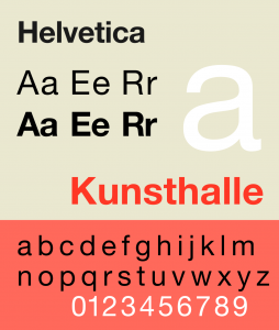
least) western society. Originally named Neue Haas Grotesk, it was created by Swiss typeface designers to match the resurfacing interest in sans-serif fonts and to promote a new age of modernism. And damn if it didn’t do its job well. American Apparel, Target, AmericanAirlines, Toyota, Jeep, JC Penny, Crate&Barrel—these are just a few of the many companies that use Helvetica for their logos. Countless street signs, posters, and websites utilize it. Even our taxes are in Helvetica! Disregarding “gray areas,” there are two main opinions on Helvetica among designers: pro and con. Here are the general reasonings presented by the two opposing sides. 

Those in favor of Helvetica cite the technical beauty of the typeface and its diverse applications as their reasons. The Cap and X heights all align perfectly with no excessive ascenders or decenders. Terminals cut off at perfect horizontals. The kerning is even while still taking into account the widths of thin and thick letters (think, i versus w). The negative space, too, is just as important! The shapes formed by the lack of ink seem to perfectly hold the letters in place. Beyond its technical beauty, Helvetica has been stated by some to be an “everyman,” because its lack of personality allows companies to inject it with their own. Furthermore, when first invented, it was used as a “wiping of a slate,” a way for a company to brush off the flourish of the 50s and align itself with modernity.

Those opposed to Helvetica tend to find it boring, a lazy first resort, or consuming and oppressive. They would argue that the identical nature of the letters strips its personality entirely (as well as that of those who use it). It is too even, too simple, and too safe. This safety is another argument. Because it is so safe, too many designers are using Helvetica as the easy way out of unique design, which can lead to the third point of opposition: conformity. Everyone, for fear of making bad decisions and to be aligned with modernity, chooses Helvetica, including big companies. Thus, Helvetica becomes associated with big business, with capitalism, and with control. Sure, using Helvetica makes companies seem rational, dependable, and hip, but how do these companies make Helvetica seem?

*This information is all based off of the documentary, “Helvetica,” directed and produced by Gary Hustwit.

Some Thoughts on Why

I would argue that almost no one is born hating art. Coloring, crafting, playing with Legos, eating glue, it doesn’t matter—kids love it. Before I could speak I was roaming over every surface in front of me with the cheapest crayons money could by. I got lucky that I kept that enthusiasm (I am still incredibly drawn to drawing on things I shouldn’t), but it wasn’t just a matter of inherent personality. It was an issue of conditioning. Sitting here, half delirious off of NyQuil, I am telling you that contemporary artists only become so as they are allowed to be. Please bare with me while I use my observations as an art camp counselor and personal experiences to argue this.

Insecurity rocks our tiny bodies once we come into social contact with other kids. Not in the way we adults have it. Body image, wealth discrepancies, and social hierarchies appear to be nebulous concepts to kids before they reach puberty. The lines are very thin and easy to break. One thing my campers did seem to understand, however, was the concept of “better.” A dangerous concept in art camp. The making of projects was fun, but the finishing of them was tumultuous, because a fair portion of the kids would look around comparing their work to others’ and find something to put themselves down for. I don’t think this was a natural instinct, because some of the others didn’t do it and the younger campers nearly never did it. I think it was learned. 

I myself have had a lot of support and positive feedback. I know this and I’m grateful for it. Given the way I’ve acted in other subjects, I don’t think I would have had the gusto to proceed in art without this positivity. So it’s like operant conditioning says: a positive reinforcement (praise) will increase the behavior (creating art) whereas a negative one (apathy, criticism) will decrease it. The kids who were happy to make art, regardless of skill, were the ones who commented most often that their parent was excited to see it or that they’d give it to them, implying that that parent was more receptive and more likely to respond positively to their art. That child, unburdened by insecurity, would be more likely to keep creating.