
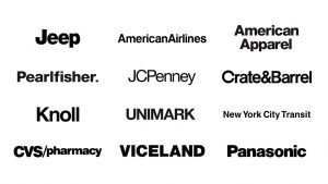
To the average person, Helvetica is an omnipotent, but unnamed force. Since its creation in 1957, it has become one of the most widely use typefaces in (at the 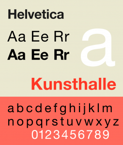 least) western society. Originally named Neue Haas Grotesk, it was created by Swiss typeface designers to match the resurfacing interest in sans-serif fonts and to promote a new age of modernism. And damn if it didn’t do its job well. American Apparel, Target, AmericanAirlines, Toyota, Jeep, JC Penny, Crate&Barrel—these are just a few of the many companies that use Helvetica for their logos. Countless street signs, posters, and websites utilize it. Even our taxes are in Helvetica! Disregarding “gray areas,” there are two main opinions on Helvetica among designers: pro and con. Here are the general reasonings presented by the two opposing sides.
Those in favor of Helvetica cite the technical beauty of the typeface and its diverse applications as their reasons. The Cap and X heights all align perfectly with no excessive ascenders or decenders. Terminals cut off at perfect horizontals. The kerning is even while still taking into account the widths of thin and thick letters (think, i versus w). The negative space, too, is just as important! The shapes formed by the lack of ink seem to perfectly hold the letters in place. Beyond its technical beauty, Helvetica has been stated by some to be an “everyman,” because its lack of personality allows companies to inject it with their own. Furthermore, when first invented, it was used as a “wiping of a slate,” a way for a company to brush off the flourish of the 50s and align itself with modernity.
Those opposed to Helvetica tend to find it boring, a lazy first resort, or consuming and oppressive. They would argue that the identical nature of the letters strips its personality entirely (as well as that of those who use it). It is too even, too simple, and too safe. This safety is another argument. Because it is so safe, too many designers are using Helvetica as the easy way out of unique design, which can lead to the third point of opposition: conformity. Everyone, for fear of making bad decisions and to be aligned with modernity, chooses Helvetica, including big companies. Thus, Helvetica becomes associated with big business, with capitalism, and with control. Sure, using Helvetica makes companies seem rational, dependable, and hip, but how do these companies make Helvetica seem?
*This information is all based off of the documentary, “Helvetica,” directed and produced by Gary Hustwit.
One response to “Helvetica”