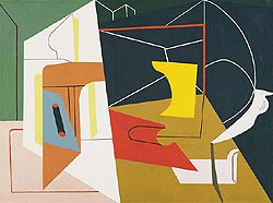
In Egg Beater No. 4, Davis creates an abstracted image of what is likely an egg beater, that appears almost like a 2-dimensional collage of cut paper through his use of color, line, and overlapping. Throughout the image, Davis used a variety of solid-colored shapes. The use of one flat color for each shape and the lack of shadows and/or highlights throughout the image give the impression of flat planes of color. The use of thin lines throughout the image also serves to flatten the image creating partial outlines within certain color planes. In, some areas, the angling of the lines seems to suggest that the image goes backwards in space, but this apparent 3-dimensionality is contradicted by the flat areas of color that overlap the forms created by the lines. The flat planes of color somewhat mimic the appearance of cut paper and the overlapping of these planes causes the painting to somewhat emulate the appearance of a collage of cut paper.
Archive for September 2018
 When I graduate, I would like to be a wildlife photographer. I would love to work for a company such as National Geographic someday. I first started taking pictures when I was in elementary school and my parents gave me a simple film camera (Which I unfortunately broke when I dropped it on our driveway). The next camera I remember getting was a small point-and-shoot digital camera that my grandparents gave me for Christmas. With that camera, I remember going around and taking pictures of my family when we would get together for holidays, especially Christmas. I started getting into photography more seriously when I was in high school and was able to take classes on it. It was in my junior year of high school that I decided that I wanted to be a wildlife photographer. In my first photography class, I remember seeing photos by Ansel Adams and thinking that I wanted to travel to all different national parks and take photos like he had. But, as I have loved animals for basically as long as I can remember, I decided that I would want to focus mostly on taking pictures of animals. The first photography class was all film photography, but in the
  second class we started to get into digital photography. Once I learned how to use a more advanced digital camera, I remember borrowing my Dad’s camera and going outside many days to take pictures of whatever animals I could find around our yard (One day I actually ended up taking hundreds of pictures just of birds, which annoyed my Dad a little bit.) Before all of this, I had bounced around between different careers, all of which were centered around some sort of art or creative expression (fashion design, interior design, etc.) , but from those first two classes, I knew that what I really wanted to do was wildlife photography.
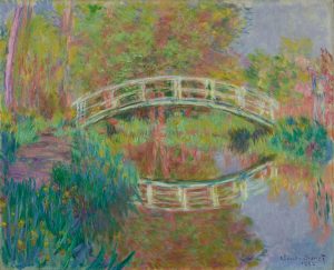
In Japanese Footbridge, Giverny, Monet creates an scene that doesn’t perfectly replicate the landscape, but instead captures the essence and the feeling of the landscape. One factor that contributes to this portrayal is the visible brushstrokes. Right away, the brushstrokes show that the painting is not meant to look completely natural. Instead, the gestural brushstrokes create a sense of movement and emotion in the scene that we may not have had with blended brushstrokes. To add to this movement are the lines created by the elements of the scene that draw the viewer’s around the painting. The pathway on the left leads the viewer’s eye to the footbridge. The bridge then carries the viewer’s from left to right across the painting until it meets the reflection on the water which completes the circle, bringing the viewer’s eye back to the beginning of the path.
Another major element of the work is Monet’s use of color. Monet’s use of color gives the painting a sense of calmness and serenity. In the painting, he uses a variety of warm colors, from the reddish-browns of the tree’s reflection and trunk to the varying shades of yellow-green present throughout the leaves and grass. Even in areas dominated by cool colors, such as the flowers in the bottom left corner, there are splashes of warm colors to balance it out. Warm tones tend to connote happier emotions, although brighter ones can sometimes connote more energized or passionate emotions. Monet prevents this by using somewhat muted colors which helps to maintain a sense of peace and calmness throughout the work. Through this painting, Monet depicts the scene not as it was, but as how he felt looking at it.
I have never considered myself to be the greatest writer. This is something that I would like to improve upon. Through this course, I hope to pinpoint specific issues in my writing style so that I can resolve each of them individually. Something that I hope to gain from this course is a better understanding about how to write about art. I would like to learn how to compose a formal essay or paper about a work of art as this is something that I believe will help me in the future. I plan to pursue a career in the arts (more specifically, as a wildlife photographer) and so I will likely have to write statements about my own work.