Narcissus by Caravaggio

In Greek mythology, Narcissus is a hunter who falls in love with his own reflection. Upon realizing he could not have the image with which he fell in love, Narcissus dies from despair and transforms into a beautiful flower. In the Italian painter Caravaggio’s depiction of Narcissus, he uses his trademark tenebrism (an extreme contrast between light and shadow) as well as isolation to produce an enthralling capture of the climax of Narcissus’ story.

In many other paintings of Narcissus, artists illustrate the surrounding forest scenery, sometimes featuring animals and other human-like figures. However, Caravaggio strips away all but the pool of water from the story’s setting. Instead, he focuses on Narcissus himself, mirroring Narcissus’ own enchantment by his image. The Greek hunter is painted in vivid colors and bathed in spotlight, providing a stark contrast to the pitch black background that blocks out the nether scenery. Just as he is mesmerized by his own reflection, viewers can only have eyes for him.

Narcissus’ impending tragedy is conveyed through the alarming darkness of the water into which he stares. His features are difficult to make out in the reflection, as if indicating that the water, despite its trickery, is no place for a human to live and love. While one of Narcissus’ hands is placed on the ground, though dangerously close to the water, his other hand dares to touch his reflection. As Narcissus leans toward to the pool of water, his serene facial features illustrating the trance under which he has fallen, viewers of the painting can sense a danger approaching, even with no lurking outside force. The danger is within Narcissus himself, and as he sits isolated from the world, he too will die isolated from the world.
Digital Marketing

image of icons surrounding the words “DIGITAL MARKETING”

Tuesday’s talk inspired me to continue to find different ways to use my time, so I can develop more skills essential to obtaining success. Being able to develop smart and engaging digital marketing strategies has been a goal of mine for a while, and I am even more aware now of just how important such a skill is. As I learned from the “Art Power” panel last month, a crucial skill to acquire is capturing people’s attention. What you have to offer will often not reach your target audience if they are not drawn to the marketing of your idea. Once you have their attention, however, news of your purpose will have a higher chance of spreading — through shares, tweets, and word-of-mouth. 

One thing that particularly stuck with me during this talk is to never underestimate the power of any platform. It has been years since I have been active on Facebook. I find Twitter and Instagram better provide the service I desire. Still, many of my friends and family members remain active on Facebook, and Facebook continues to have an overwhelming number of users. Though I personally do not spend much time on Facebook, if I want to increase my online presence, it would be unwise to ignore the reach Facebook still has. 

My use of Facebook will still certainly differ from how I use other social media platforms; that’s because Facebook simply is different. Every platform for digital marketing should be approached individually. Some marketing formats work better with one platform over another. I must ask myself questions like: Is it appropriate to use sarcasm to be humorous on this platform, or is it more likely to be received as hostility? My audiences will vary from platform to platform, and while I aim to convey what I plan to share with others, I must also keep in mind how different audiences will receive what I put out into the world. 

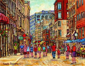
Painting of Rue St. Paul, Vieux – Carole Spandau

A painting of people strolling through a cityscape of Rue St. Paul, Vieux by Carole Spanday

This painting in Carole Spandau’s collection of cityscapes of Rue St. Paul, Vieux, Montreal uses vibrant colors and basic shapes to convey a lively and busy city scene.

Very few dark colors can be seen in the painting, and those that are present accent fire truck reds, bright sandy hues, and sunny yellows. The use of these colors throughout the entire composition, without interruption by duller shades, brings a wondrous energy to the scene. Even the faceless human figures exude the same energy. Most of them have warmly colored hair — either red or blonde —and they sport bright clothing. Their tilted postures, from pointing arms to turned heads, convey a sense of constant activity.

The inability of the viewer to perceive detailed features on the faces of the strolling people, or on any aspect of the location, additionally add to the image of a bustling city. Instead of becoming engrossed in insignificant details, the viewer is encouraged to take in how overwhelming the sheer quantity of people and buildings are. There are few empty spaces on the canvas: the bit of sky at the top center and the pavement at the bottom of the painting are the only unoccupied areas of the scene. Not even the horizon is visible. The land beyond what the viewer can see is likely taken over by the same urban livelihood seen in this painting.

The vivid colors and the simpler depiction of urban structures permit the viewer to not just take in the easily perceptible view, but to also be absorbed by the feeling this scene of Montreal offers. The viewer is invited to feel just as joyous and amazed by the animated setting.

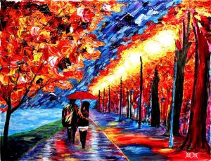
Shared Moments – John Bramblitt

John Bramblitt’s painting ‘Shared Moments’ drifting a couple walking in the rain

John Bramblitt is a blind artist known for his vibrant paintings. His work Shared Moments was the first to catch my eye. I was intrigued to learn how Bramblitt could paint such a detailed and carefully composed scene without vision and was further fascinated by his artistic choices. 

In the FAQ section of Bramblitt’s website, the artist explains how he is able to decipher between different paint colors by their textures and viscosity. He mixes the paints to achieve various effects, as well, such as glazing. Simply put, the key to painting without sight for Bramblitt is by using his sense of touch. 

In his work Shared Moments, I can see the importance of touch in painting through the textures of the paint, in addition to Bramblitt’s ability to nonetheless highlight the value of color. The more obvious and thick brushstrokes on the leftward autumn tree provoke a different response from the smoother application of paint on the wet ground. The thick-leaved nature of the trees provide an emphasis on emotion; the brushstrokes pop out at viewers. Additionally, their fiery colors represent the passion of what appears to be two lovers strolling down a sidewalk. Warm colors like red and yellow convey love, jubilation, and hope. The red color of the umbrella shared by the couple further emphasizes these feelings and illustrates the loving relationship between the two lovers. 

The smoothness of the ground beneath the couple’s feet constrasts the thick brushstrokes of the trees, suggesting a sense of ease between the romantic partners. The blue color that dominates the pathway further conveys this ease. Still, the reflection of other colors onto the sidewalk communicates that the couple’s relationship is not one-note. Reds, greens, and other hues signify a dynamic bond between the partners and furthermore connect the foundation of their relationship (the walkway) to their burning passion represented by the trees. A trail of warm colors circle around the couple’s feet and lead to the base of the rightmost tree. From that tree trails a line of other trees receding into the horizon. The heads of the colossal plants all radiate golden-white light, like street lamps. It is as if the trees are expressing that the couple have a bright future ahead of them, as they walk in the same direction the trees flow into the horizon. 

Bramblitt’s Shared Moments is a touching work of art, and the magnificence Bramblitt achieves through it without sight to guide him is unbelievable. As I admire the work repeatedly, I frequently think of Bramblitt’s words on his experience as a blind artist: “What I discovered was a whole new world of perception that in many ways equaled eyesight, but in some ways actually exceeded it.” Bramblitt believes that sight can be a limiting factor of detail in art, and it makes me reflect on my own limitations. There is always a different perspective through which one can view art to deepen their understanding and sense of enlightenment. 


References

https://bramblitt.com/pages/faq

React to the Past

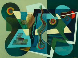
Image of Frederick Kann’s painting ‘Sympatica’

The react to the past game was a very fun experience and one I think deserves to be offered to many more students. The game does need a few tweaks so it runs more smoothly, like ensuring necessary details are known to all who need the information. Still, our game sessions were overall straightforward and enlightening. 

Throughout much of art history, there is a significant focus on an elite few dictating the rules of art. For instance, the Classical art style was highly praised by an Academy, which constructed a hierarchy of genres in art. Regardless, rules on how to apply paint, how to use color, and how to compose a work of art were present throughout the genres of art. Similar high expectations were placed on artists during the 1930s by the elite class, as well. But not only were artists expected to cater toward these preferences if they wanted to achieve success, they were also limited by the possible drawbacks of exercising free political speech in art. Regionalists and Social Realists had to be particularly careful because they created representative works of art, which was favored by the privileged class. However, Abstractionists would compete against these artists holding the belief that, while Abstractionism strays from the styles of art that receive the highest praise, it is void of personal bias and exclusivity. 

Many artists from all three movements could, however, agree that their art could be powerful tools to fight Fascism, the common enemy of the right to free artistic expression.  Consequently, artists had to balance the need to surpass their competitors and obtain success with the value in uniting for a cause that could benefit the entire art world. The art community today is still both highly competitive and supportive, but I believe our contemporary society is more privileged than America was eighty years ago. Censorship is not so pressing a concern and diversity in art is embraced far more. Because contemporary art is almost timeless due to its historical influences and rapidly evolving state, there appears to be no desperation to define this period of American art, except perhaps among art historians. What has not changed from the 1930s, though, is that artists still must be aware of their audiences and must be wise about how they put their art out in the world, especially if their works contain strong persuasive messages. Art is powerful and beautiful, but it is not welcome with open arms by all, whether it is the style or the message that serves as one’s “make-or-break.”

Fashion is an Art

Even today, the debate regarding whether or not fashion is an art form continues. The discussion is layered and complex, but in the broad scope of things, fashion is indeed art. In its simplest definition, art is a form of creative expression. Fashion is too a medium for creative expression. Therefore, fashion is art. It is distinct in the way paintings, sculptures, film, and music differ from each other. But an analysis of fashion will reveal its many similarities to the fine arts and other forms of artistic expression.

In protest of fashion being considered an art, opposers reference fashion’s practicality in contrast to “true” art’s lack thereof. [1] However, could a colorful, whimsical dam in the shape of a dragon not be considered both art and a practical structure? And what elevates the most minimalist painting above an intricate article of clothing? Though the two items would differ in numerous ways, they can also share many similarities. One, the items would be capable of providing insight into the time period in which they were crafted. Just like fine art, fashion has an extensive history of evolution that reveals distinctions in social classes, technological advancements, widespread ideologies, the relevance of religion and laws, and standards of beauty. Sometimes, beauty is prioritized over functionality in fashion, or the wearer must practice the separate “art,” if you will, of not falling victim to the hazards of their extreme fashion. Inventions of heelless platform boots and 20-inch heels are positively impractical, but practicality and safety come second to their powerful creative expression. [2]

Two, fashion can be an artistic outlet for an individual’s thoughts, feelings, and personality. Many painters like Van Gogh have conveyed their inner self through their works. Likewise, a myriad of fashion styles exists from gothic to bohemian, with the purpose of outwardly displaying one’s individuality. At some point or in some manner, many of these styles were or are considered avant-garde, boldly venturing away from social norms like Abstractionists veered from the Classical art style. Such movements were not just a means of personal expression among a few. They were groundbreaking changes in the art world. As art continues to do, the art of these avant-garde movements offered critiques of society and Academy-style artwork. Once again, fashion is capable of achieving the same, persuading onlookers with shocking imagery or inspiring repressed followers of cultural norms to come out of their shells.

Fashion and fine art remain distinct, but they are both art forms, ever-evolving, creative, and diverse in their achievements.


References

  1. “Is Fashion a True Art Form?” The Guardian, Guardian News and Media, 13 July 2003, www.theguardian.com/artanddesign/2003/jul/13/art.artsfeatures1. 16 Oct. 2018.
  2. Erika. “Highest Heels in the World – 5 Tallest Shoes of All Time.” Your Next Shoes, 23 Apr. 2018, www.yournextshoes.com/highest-heels-world/. 16 Oct. 2018.


Art Power Panel

CREATIVE TIME Logo

The Thursday panel of “Art Power” offered a compelling look into the strong influence of art, from its value as a tool for free expression, to its ability to catalyze radical change. I was shocked to learn that the current political environment in Hungary drove many artists to leave the country in order to obtain greater artistic freedom. But I also was intrigued to see the nation’s dilemma reflected in the React to the Past game in which we are participating. Like the members of the American Artists Congress, the emigrating Hungarian artists are exercising at least one approach to resist the oppression, manipulation, and neglect of artists. It is inspiring, but the situation must be approached with care.

Change cannot happen overnight, nor can entire systems simply be overthrown. But there are multiple ways to tackle a problem and successfully subvert the regulations of an institution through art. Dr. Matthew Mongiello lists three means of action that can be taken: a pluralist approach, a disruptive one, or a plebiscitary method. In many cases, the third tactic is most effective when carefully executed. It often manifests in the form of protests, demonstrations, and marches. The best of them balance the ability to grab people’s attention and to frame a message so it is digested in the intended way.

This is not an easy balance to achieve, especially because, like words, art can be twisted to be interpreted or relayed differently. Imagery meant to shock to send a message can be reduced to a crass act. A lack of unity in the execution of persuasive art or too much uniformity can leave viewers confused about or apathetic toward a cause. The right means of execution is something the Congress in the React to the Past game had certainly struggled to obtain. As our class attempts to walk in their shoes, we will gain valuable perspectives of the art world that will be useful to use in our lives as artists.

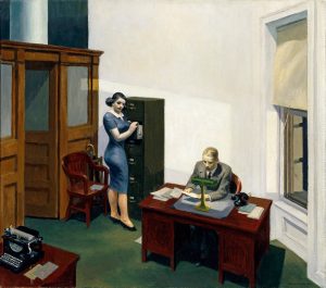
Office at Night – Edward Hopper

Painting "Office at Night" by Edward Hopper

Color and linework pop in Edward Hopper’s Office at Night (1940). Though the hues in the painting are bold, they are not bright. The furniture is burgundy and army green, and the floor is a murky aqua. While the lamp on the desk casts light onto the male figure and the paper he is holding, the lighting is still soft. Similarly, the light cast across the white wall is just bright enough to make the human figures stand out against the background. The colors across the canvas are mostly balanced in a subtle manner. Noticeably, the chair and desks match in color, as well as the typewriter and telephone. Less obviously, the papers around the room share similar hues from ash blue to off-white. The red lipstick the woman is wearing appears to match the man’s tie. The woman’s lipstick also forms a rectangle of the painting’s most vibrant colors, with the green and yellow of the lamp and the blue of the woman’s dress.

Speaking of rectangles, the shape is repeated throughout the image. The army green file cabinet, the desks, the sheets of paper, and the windows are all rectangular. The vertical lines that form most of these objects communicate a sense of order. The composition of the painting is indeed highly organized. In an interesting contrast, however, Hopper also uses many diagonal lines. As a result, the floor appears to be slightly tilted, as if everyone and everything in the room could slide to the right end. In fact, if the viewer visually traces the top right end of the brown door down to the woman’s head and further down toward the man, the viewer will notice a blatant diagonal composition forms. The diagonals also heighten the cramped sense of space, which in turn is emphasized by the strong offset of the colored environment against the white wall. The blankness of the off-white surface makes a small setting feel tinier, by intensifying the viewer’s attention on the colored area of the painting. 

Hopper’s Office at Night also displays a strong sense of naturalism, despite the clear brushstrokes.

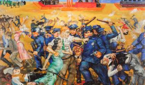
An American Tragedy (1937)

Philip Evergood’s An American Tragedy (1937) is a chaotic composition depicting a violent clash between police officers and citizens. The limbs of the depicted human figures are positioned in vertical, horizontal, and diagonal directions. Only the police wield weapons in their hands, in the form of batons or guns, save for the female figure wearing an aqua-colored dress. She holds a long stick in her hand, yet it is her left fist that is raised.

Also striking is the composition of the figures: the horizon line is almost seated at the top edge of the canvas. Most of the officers and citizens are tightly squeezed at the forefront of the scene, their bodies occupying about three-fourths of the height of the canvas. The humans do not appear as naturalistic as the figures in Classical art. They are not abstract either, but their features become significantly less clear as they are positioned closer to the background.

Still, color choices are consistent across the oil painting. The bold blue color of the police uniforms is overwhelming and pops against the yellow ground. Other prominent and distinct colors include green, red, and white. The aqua dress leads the viewers’ eyes to the green tie of the man behind her and up to the trees in the background. Red is centered in the background and also scattered in the form of blood. White smoke runs horizontally from one end of the canvas to the other.

The use of so many bold colors heightens the chaotic nature of the depicted scene. It is as if the colors are still fighting to be the most prominent hue. As practically every area of the work is painted with rich hues, every component of the artwork appears that much more important.

CEO Talk

Logo for McDaniel College's Center for Experience & Opportunity

Tuesday’s session was incredibly useful and motivational. Job searching has always been a concern for me. It’s intimidating, and I am afraid of failing or finding myself in a rut while pursuing work. It’s hard for me to feel confident or to accomplish many things when I don’t believe I have the skills to achieve my goals, especially when it comes to putting my foot in the door for valuable opportunities in life. If I’m too afraid to try at all, though, I’ll never succeed.

One of the most important lessons I learned during the CEO talk was knowing when to say ‘yes’ and when to say ‘no.’ For example, even while pursuing my dream job, it could be wise to accept other jobs that seek to employ my talents and dedication. It would increase my experience in the job field, encourage me to practice and learn different skills, and perhaps provide me with pay, which is always valuable. However, I cannot pursue or accept opportunities I cannot follow through on. Canceling plans or not putting forth my best work only makes me appear unprofessional and thus undesirable to employers. It is better here to say ‘no.’

Another valuable takeaway from this talk was getting to explore a variety of career networking platforms, to which I had no prior exposure. It will be much easier for me to begin searching for internships or jobs, and knowing the benefits of networking has encouraged me to ensure I make connections with various people.

Before this session, I was aware of the significance of a résumé, but it was helpful to really visualize the correlation between a solid résumé and the employers to whom it is intended to be given. I learned that when building a résumé, it is important to keep in mind who will be reading them. There is room for creativity, but flair is not going to impress all employers nor will a standard résumé be enough to catch the attentions of others. Research into my employers is vital because the employers appreciate such dedication and I will be especially prepared for the task I intend to tackle.

Perhaps, most importantly of all, hard work is what will earn me the rewards and accomplishments I seek. I need to invest time into hunting for jobs, I need to practice my skills every day, and even if I am not officially employed, I can still make other accomplishments, no matter how small. The hard work adds up.